|
|
Karen Andeen's Work, Problems leading up to my Prelim
|
Unfortunately, at the last
minute here, I am having various problems. The main problem is that
depending on how I make my plots in root, they turn out vastly
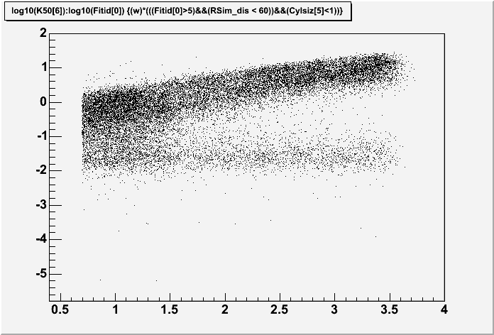
different. For example, I have below two scatter plots of log10(K50)
vs log10(S30). I expected them to be identical, however, they are
not. The difference between them is simple. For the top plot I
typed into root:
h100->Draw("log10(K50[6]):log10(Fitid[0])","w"*(Sim_S30RC));
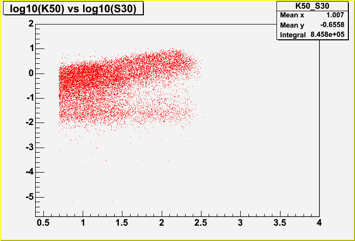
For the second plot, I typed this:
 TH2F *K50_S30 = new
TH2F("K50_S30", "log10(K50) vs log10(S30)",10000,0.4,4,10000,-5.8,2);
K50_S30->SetMarkerColor(02);
h100->Draw("log10(K50[6]):log10(Fitid[0])>>K50_S30","w"*(Sim_S30RC))
The "w" is my weighting function, and Sim_S30RC is my S30, radius
and cylinder size cuts. If you'll notice, the plots are identical
until log10(S30) = 2.5. After that, the histogram for which I have
defined bins and range and things cuts off entirely, while the top one
keeps going. If the events are actually being cut out, there's a huge
problem, but so far I've spent an entire day trying to figure out why
it looks so terribly different with no success! If anyone understands
this problem, let me know, I'd be happy to hear it.
Note that the reason I'm using 10000 binson each axis is that 1000, 100, or 10 just don't match at all. 100 bins is the only one that doesn't cut off on S30, but the distribution of events looks totally wrong. Here are examples of 1000, 100 and 10 respectively:
The scripts that I'm using are here:
Basic Loop
The Weighting Function
Radius Calculation
The Data Files (You may want to right click and save this one??? Or it's on the Madison machines at /data/kandeen/spase/data/sim_old/reco_Oct2005/mergedsim.root)
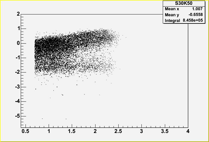
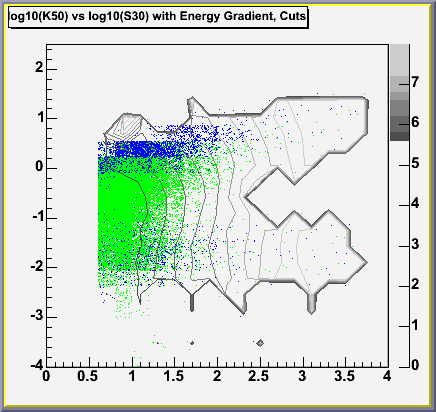
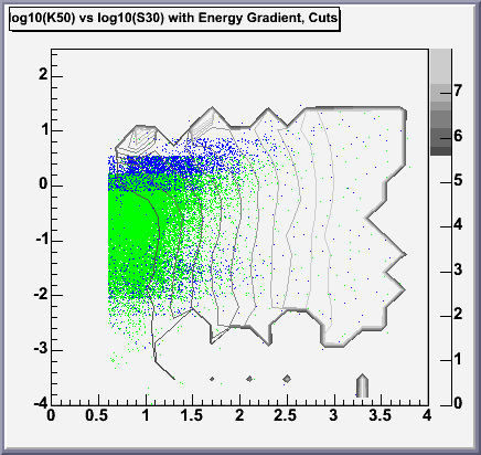
The next problem I'm having (which might be solved if I can solve the
first problem, but I'm not sure of that) is that I have produced two
possibilities for the log10(K50) vs log10(S30) plot and I'm not sure
now which one's right. Again, I will let you see the differences for
yourself. But no matter which plot is correct, I obviously have a lot
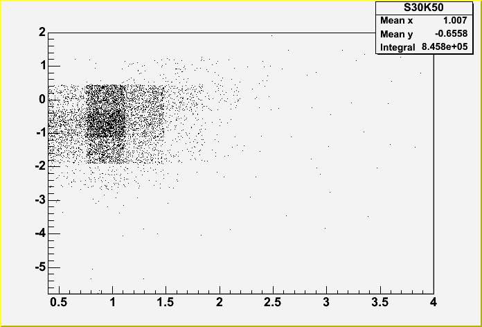
of "stragglers" at low K50 but high S30, which is another problem.
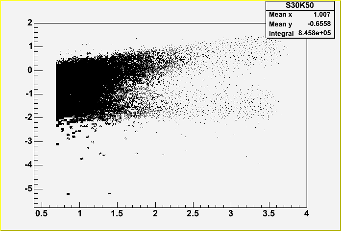
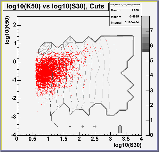
Additionally, if you look at the third plot (the one in red) it is
immediately apparent that the same problem does not exist in the data.
Thus there is some problem with the Monte Carlo. This problem
concerns me greatly because this is the same Monte Carlo we've been
using for a good long time and this problem did not seem to exist
before. Thus, I've been making lots of plots to see if we can get to
the root of it. I'll discuss those next. On the left below we have
the plot from January, on the right is the one I made in February.
Below is the experimental data.
Now, I've been making a bunch
of plots to see what the problem could be (for results of some of
these plots look at my January plots
here). In summary, the only variable that has yet been found that
has a very strong correlation to the low K50 at high S30 is Nchannel,
and so I am keeping in mind an nchannel cut. However, I'm not sure
where to make it, or whether this is a good idea. Additionally, due
to the problem explained above, I now know that the numbers on the web
page referenced just above the numbers are wrong in the chart. For
more reasonable (but similarly untrustworthy) numbers and percentages
of data that would be cut for every cut level on Nch, see my Early
February page: here. I am
currently exploring the possibility of other variables, such as track
length and radius from the center of AMANDA (which I had neglected to
check earlier). Those plots will be posted soon, along with
recreations of all of the plots on the January page, likely with
different numbers yet again! (Urgh!)